We’ve made a few improvements! First, we spruced up the SDK Explorer with a fresh user interface (UI) and an SDK tracking feature. Second, we made the search functionalities on our documentation page a little easier to use by redesigning the navigation menu.
Here’s what we cover in this blog post (click the links below to jump to the corresponding section):
- The New and Improved SDK Explorer
- Tracking SDKs With the SDK Explorer
- User-Friendly Documentation Search
Want to test these updates? Sign up for a free trial!
The New and Improved SDK Explorer
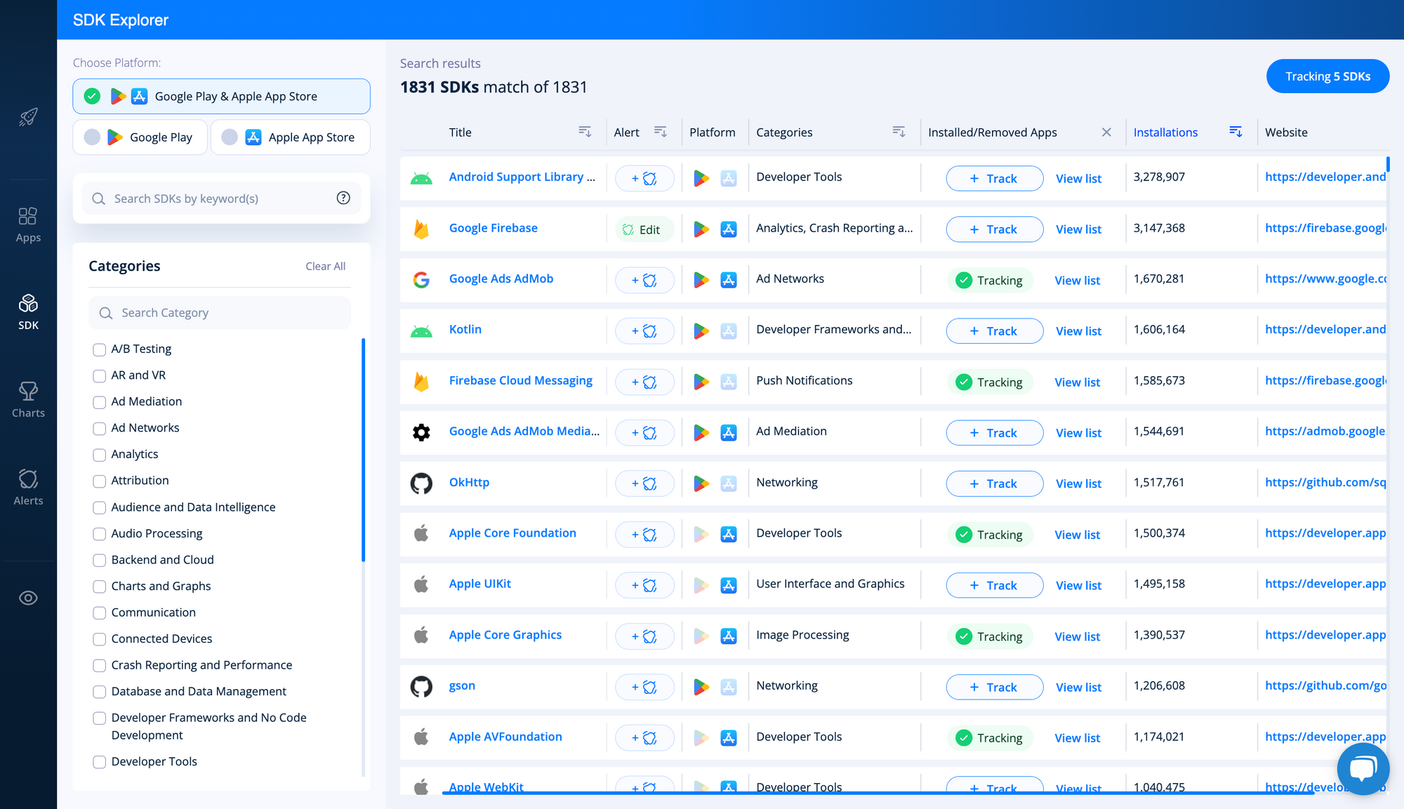
Let’s begin with the SDK Explorer’s fresh, new user interface. In case you haven’t noticed, we’re in the process of updating the look and feel of the 42matters brand. This extends from our newly refurbished website to our app and SDK intelligence products.
Most recently, we turned our attention to the SDK Explorer. Check it out:
It’s come a long way since version 1.0:
But the new SDK Explorer is more than just a pretty face. We also gave it a number of cool new features to help you better understand the SDK industry and keep an eye on SDKs relevant to your business. We introduced some of those new capabilities back in May, but there’s one more we’d like to share with you…
Tracking SDKs With the SDK Explorer
The SDK Explorer’s new SDK tracking feature makes it easier for you to keep an eye on installation trends for key SDKs.
To begin tracking an SDK, click the button labeled + Track in the Installed / Removed Apps column:
You can then pull up a list of all the SDKs you track to compare installations and removals by clicking the Tracking SDKs button in the upper right-hand corner of the dashboard:
Here’s what it looks like when you browse your tracked SDKs:
Okay, let’s move on from the SDK Explorer…
User-Friendly Documentation Search
If you use any of our APIs or File Dumps, you’re probably familiar with our documentation page. If not, you can check it out here.
In any event, we’ve developed quite a few data products over the years, and we’re planning to add even more in the months to come. While this is great for our customers, it wasn’t so great for our documentation page, which became cluttered and increasingly difficult to navigate.
So, to address this, we gave the page’s navigation bar and search capabilities a re-think. Here’s the new and improved design:
You can search for specific APIs or File Dumps using the Search by Name field at the top of the navigation menu:
In addition, you can now expand and collapse each section to keep the SDKs that matter to you easily at hand:
And that’s that! If you have any questions about these updates, don’t hesitate to reach out to our team!


